repost: Styling Tables the Modern CSS Way
HTML tables are almost as old as the web itself, and have been used — and abused — for decades. Once upon a time, intrepid web designers hacked together complex layouts using tables, in the absence of other suitable methods. Thankfully that’s no longer common practice today, but tables are still a vital part of the web, and are crucial for displaying tabular data — two-dimensional data, organised in rows and columns.
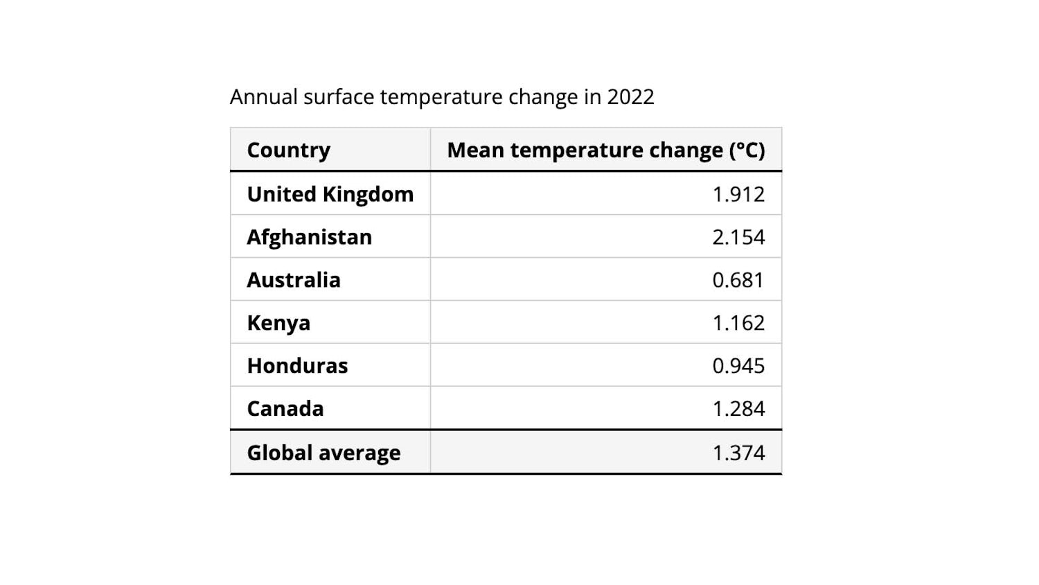
Our table context for this article.
Creating good-looking tables on the web can be fiddly at times. We’re going to run through some tips and gotchas for building simple and complex tables in HTML and CSS, and where modern CSS can help us.
# Elements of a table
The data we want to display shows average temperature changes from the baseline in 2022 for different countries around the world. (Source: International Monetary Foundation.)
Like any good Piccalilli article, we’re going to start with solid markup. This means that even without any additional styling, our table will be visually understandable, and parsable by screen readers.
The <table> element is vital for wrapping our table content. The <thead> and <tbody> elements contain the table’s header and body rows respectively. <tr> elements form the rows, which contain <th> (header) and <td> (body) cells. We’re also using a <tfoot> (footer) element to show the global average temperature change at the bottom of the table.
1 | <table> |
Both our rows and columns have headers (the <th> element). To ensure our content can be easily interpreted by assistive technologies, we can include the scope attribute with a value of row or column , to infer which axis the heading belongs to. This might not be strictly necessary for a simple table such as this, but will certainly be useful when we extend our table to become more complex.
1 | <table> |
Lastly, let’s add a caption to our table to summarise its content. We’ll use the <caption> element for this, which must be the first child of a <table> element.
1 | <table> |
The W3C Web Accessibility Initiative (WAI) provides different examples of ways to accessibly add more complex summaries to a table.
# User agent styles
If we view our table in a browser, it doesn’t look too great just yet. Our headings and caption all centre-aligned, and there’s no way to differentiate between the header, footer and body rows.
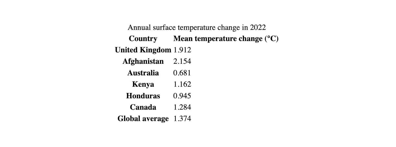
These days, browsers are fairly consistent in their default table styles. If we inspect our <table> element in the browser’s developer tools, we can see the following styles applied:
1 | table { |
Some of these properties are useful to us. For example, browsers apply font-weight: bold to <th> elements, which differentiates the headings from body cells before any other styles are applied. Without any custom CSS at all, we can see a clear relationship between the row and column headings and their corresponding data, giving users a good minimum viable experience.
Other user agent styles are less helpful. Let’s apply some base CSS to “reset” our table and make it a little easier to style.
FYI
Whatever you do, don’t be tempted to change the table’s display property value to grid , just to make styling easier. You’ll break the baked-in accessibility that browsers provide for free, rendering your table inaccessible to users of assistive technologies.
# Modern CSS reset for tables
Let’s assume we’re setting a font on the <body> in our CSS file. Our table will inherit those font styles, so that improves the look of our table somewhat.
1 | body { |
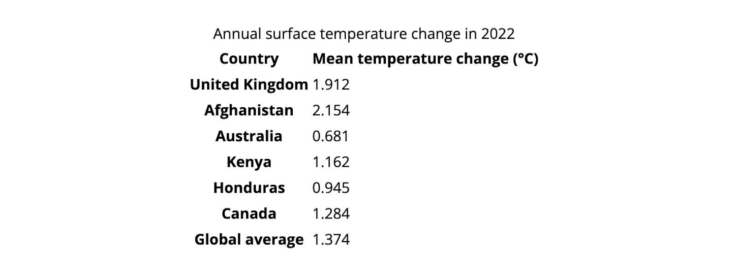
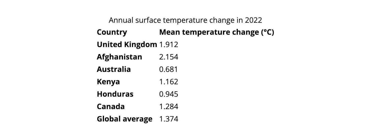
Aligning the text to the left is another way to instantly improve the readability of our table (seriously, why would you centre-align row headings?!). Setting the text-align property on the whole table takes care of that, and allows for the option of changing the alignment of individual table columns or cells later on. I’m a big fan of leaning on inheritance when it’s useful to us.
1 | table { |
Now let’s imagine for a second we’d like some grid lines between our table cells. We can’t simply add a border to every table row.
1 | /* This won’t work yet */ |
If we add a border to every table cell, we can see by default there is a small space between them.
1 | th, |
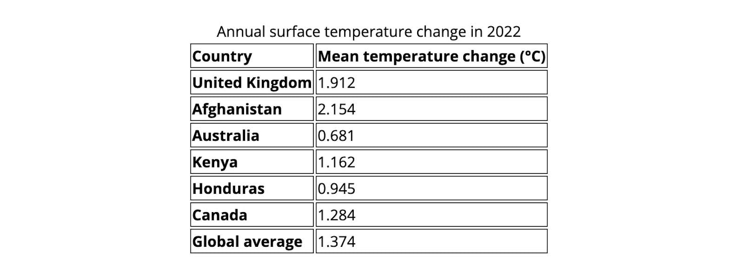
This isn’t particularly helpful for creating nice looking tables. We’ll set the border-collapse property on our table to collapse instead of the default value: separate . This will result in our table cells sharing their borders with one another, looking much more like we’d expect a table to look.
1 | table { |
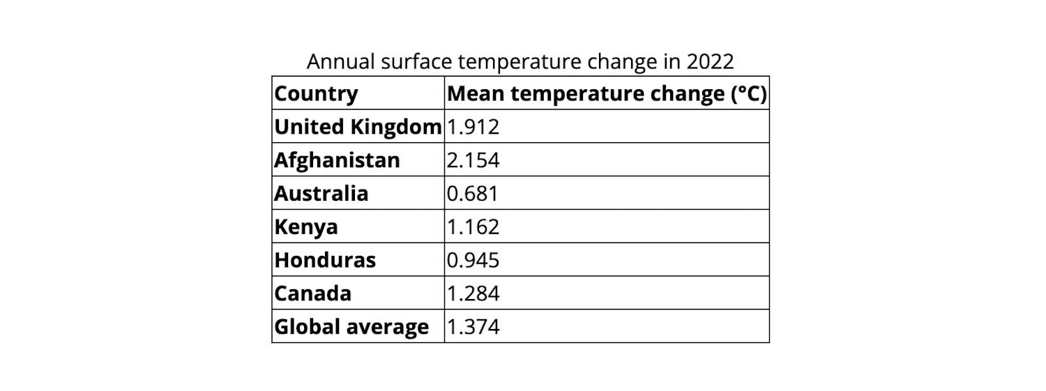
One handy symptom of this change is we can now also set a border on the table rows — rather than just individual cells if we wish.
# Design considerations
When it comes to bespoke table styles, there are a few design considerations we should be aware of.
# Text alignment
In languages written from left to right (such as English), text is generally easier to read when aligned to the left, while the reverse is true for right-to-left languages. Numeric data, on the other hand might make more sense right-aligned in some cases, as it can be easier to compare values against each other or a sum total.
To account for languages that may have a different written direction to the default, we could use logical values for the text-align property. text-align: start will ensure that if a different direction is set on the table (or on the document) the text alignment makes sense.
Applying text-align: start to the <table> element doesn’t work across all browsers, but we can set it on our table headers and caption. As the rest of our table cells contain numerical values, we’ll align those (and their corresponding column headers) to the end:
1 | th, |
# Headers and footers
Row and column headers are already differentiated by their bold font weight, but marking out the header and footer rows more clearly would make this table easier for users to understand. We could do this by adding a heavier border to those rows, or changing the background colour (or both).
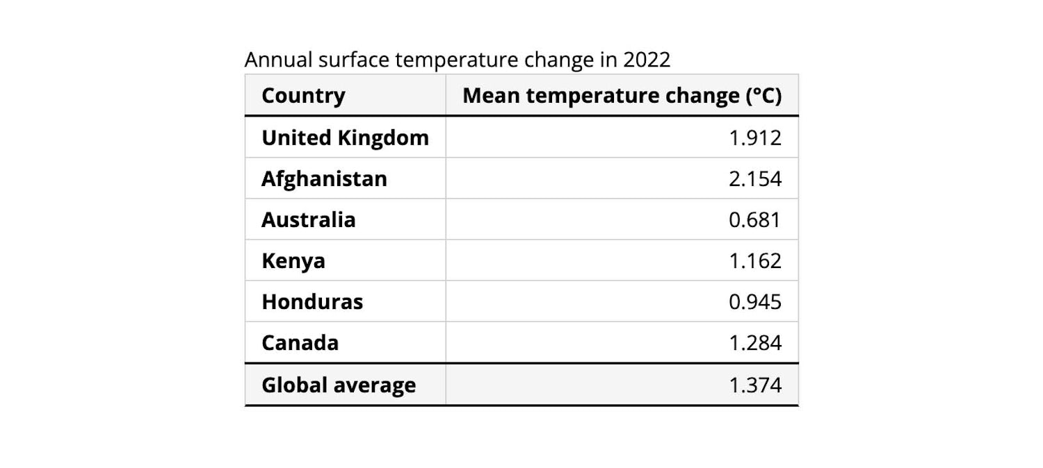
We can use the logical border-block properties to style the borders on the block axis only. (We’re adding some padding to our cells here too.)
1 | thead { |
Borders between columns might not always be necessary, as the alignment of the cell content naturally helps our brains to discern a column relationship. It might help readability for large or complex tables though. I generally incline towards knocking back cell borders to a lighter colour compared to the header and footer, to avoid the table feeling overcrowded.
# Colouring rows and columns
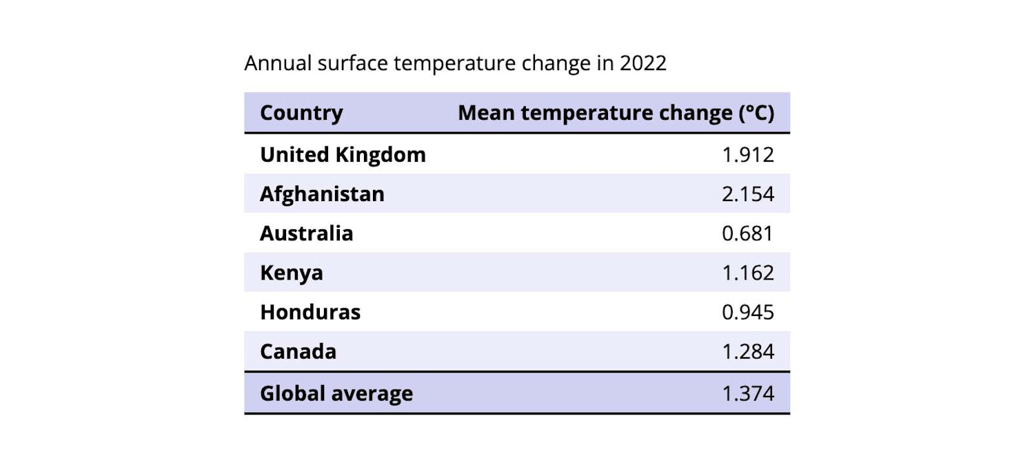
Alternately colouring the table row backgrounds is another way to assist with the readability of a table as an alternative to borders. In this example we’re setting a theme colour as a custom property on the table, and creating a transparentised variant of the same colour to subtly colour alternate rows, using the CSS color-mix() function.
1 | table { |
# Styling with CSS
Beyond these design considerations, there are some practical things to consider for a user navigating our table. Let’s look at how CSS can help us here.
# Caption position
Perhaps we would prefer our table caption to be positioned after the table content? We can use caption-side property for this, which will ensure the visual order still reflects the order in which table elements are perceived by assistive technologies.
1 | table { |
# Managing overflow
Adding many more columns to our table (or viewing in a narrow viewport) could cause horizontal overflow of our webpage. In this second table example, which uses a larger dataset, we can see this more clearly.
See the Pen Managing table overflow by piccalilli (@piccalilli) on CodePen.
We can avoid the need for users to scroll the entire webpage in order to view our table columns by wrapping the table in an element with overflow: auto or overflow: scroll applied.
1 | <div class="wrapper"> |
1 | .wrapper { |
See the Pen Managing table overflow with scroll by piccalilli (@piccalilli) on CodePen.
Now users can see all the data in our table by scrolling the table itself. It’s not a great experience though, as they would still need to scroll all the way back to the start to see the row header names. That’s pretty annoying, and they could easily lose their place in the table.
# Sticky rows and columns
We can ensure our row headers stay visible as the user scrolls with sticky positioning.
1 | th:first-child { |
FYI
inset-inline-start is the logical property equivalent to left in the left-to-right writing mode so you could use left: 0 instead.
We’ll also need to give those table cells their own background colour because currently only the row background is styled and the row content will be visible beneath the row headers as the user scrolls.
1 | tbody th { |
A slightly inconvenient side-effect of this behaviour is that the right hand border of our row headers disappears under the header content when the table is scrolled. We can fix this with a workaround, albeit one that feels a little hacky.
First we’ll remove the right-hand border of our header cells using the border-inline-end logical property (equivalent to border-right in left-to-right writing mode).
1 | th:first-child { |
In the code above, we’re using the :where() pseudo-class to reduce the number of lines of code. This says “select the second <th> that is a child of either <thead> or <tfoot> ”. Otherwise, we could write both selectors separately:
1 | :where(thead, tfoot) th:nth-child(2) { |
Then we’ll style the ::after pseudo-element, positioning it along the right-hand edge of the row headers.
1 | th:first-child::after { |
See the Pen Fixing the table border by piccalilli (@piccalilli) on CodePen.
# Accessibility
Adrian Roselli kindly made me aware that this solution as it stands isn’t accessible to keyboard users and screen readers. To improve upon this, we need to give our scrollable area a role and an accessible name for screen readers to announce, as well as making it focusable for keyboard users. We can use aria-labelledby , with the table’s caption ID as its value.
Giving the wrapper element (the scroll container) a tabindex of 0 satisfies the latter requirement.
1 | <div |
We should also use CSS to provide a visually distinct style when the scroll container is focused. I like Adrian’s solution of using attribute selectors to style
1 | [role="region"][aria-labelledby][tabindex]:focus { |
As Adrian notes in his article, Under-Engineered Responsive Tables:
This selector ensures the table will not be clipped unless the HTML is properly marked up to be accessible to keyboard and screen reader users.
Adrian also recommends adding shadows as visual scroll cues, as on some browsers the scrollbars disappear. He suggests a technique adapted from Lea Verou, using background-attachment: local . Here’s the code snippet, which is also included in the final demo — you can read the full details in Adrian’s article.
1 | div[tabindex="0"][aria-labelledby][role="region"] { |
Now users can see all the data in our table by scrolling the table itself. It’s not a great experience though, as they would still need to scroll all the way back to the start to see the row header names. That’s pretty annoying, and they could easily lose their place in the table.
# Vertical alignment
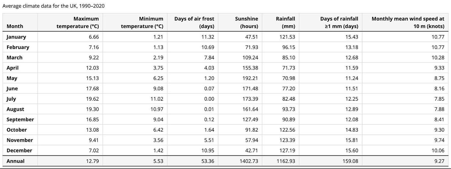
When our table columns are narrower than the content, the text will wrap. By default cell content is center-aligned vertically. This can sometimes be desirable, but for some types of data it can make the table harder to read. With text content it could be more appropriate to align horizontally with the baseline.
Column headings, on the other hand, might benefit from being positioned at the lower end of the table cell, so we don’t end up with some headings floating high above our table data.
How you choose to align your table content depends on the design and user requirements, but we can control the vertical position using the vertical-align property on our table cells. Let’s align our column headings to the bottom and our table body cells to the baseline.
1 | th, |
# Column sizes
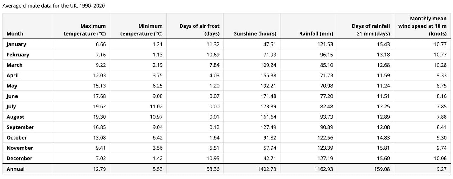
You might notice that our table columns are unequal widths. Here the width of each column is determined by the length of its heading, which is longer than the content in the body cells. Our table would be much easier to read if the widths of the body columns were equal.
To begin with, the width of our table is determined by the content. If we set a width on our table, it starts to look a it better, but our column widths are still uneven. We could address this by setting the width of each header cell apart from the first one:
1 | thead th:not(:first-child) { |
When the viewport is narrower, we’re still left width uneven column widths, so more control of column sizes is needed.
For more control over column sizes, we can change which algorithm the browser uses to determine the table layout using the table-layout property.
Changing this to fixed (from the default auto ) causes the browser to ignore cell content and instead use the widths defined on columns or cells for the first table row to resolve the column widths.
FYI
If this sounds a little complicated, CSS Tricks covers it in a lot more detail, with handy demos to illustrate.
For a fixed table layout to work in browsers today, we also need to set the width property of the affected table. We’re using the max() function here, which tells the browser to pick the largest value of the two arguments — 65rem, or 100%. This means our table will be at least 65rem at small viewport sizes — which is fine as it’s scrollable — while in larger viewports it will take up the entire width available.
1 | table { |
Our table columns should now all have equal widths, but we might want our a different size for our first column (which contains the row headers). If we set a width on the first <th> element, we can then see that the remaining horizontal space will be distributed evenly between the rest of the columns.
1 | th:first-of-type { |
# Final demo
Go ahead and toggle the HTML or CSS panel to see how our table responds, responsively.
See the Pen Our final demo! by piccalilli (@piccalilli) on CodePen.
# Learn more
We’ve mainly focused on CSS for styling a (relatively) simple table. Tables perhaps aren’t the most exciting things to build on the web, but they’re important for certain types of data, and full of little quirks that can trip you up — as well as interesting things to learn!
To learn more about structuring HTML for complex tables, including column and row groups, and spanning multiple cells, visit MDN’s table guide.