转载: Quick & Dirty Theme Switcher | Ugly Duck
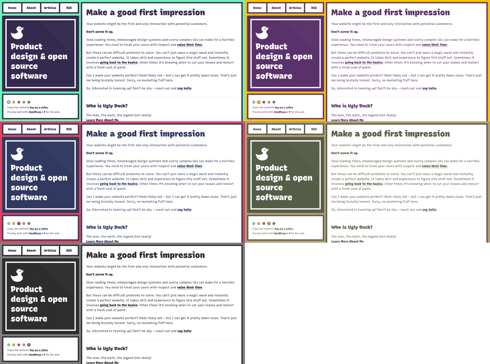
I recently added a fairly straightforward color scheme (theme) switcher to my personal website. You can toggle this simple color switcher in the footer of the site to see it in action. In case anyone else had the desire to add such functionality to their own sites/projects, I figured I’d write up a quick post explaining how to do so. Let’s get into it.
 My website color scheme switcher in action
# The HTML
First we need to include the “buttons” that will trigger the theme to switch based on which one is selected. (Note: you could always render these as options in a select element if you preferred that method)
1 | <div class="color-select"> |
That’s it! Don’t worry too much about the onclick parameter right now, we’ll come back to that when adding our JavaScript. The only remaining item is adding a default theme class to our html element, like so:
1 | <html class="theme-default"> |
# The CSS
Next we need to style both the color-select buttons, along with the custom color schemes that will alter the entire website. We will start with the color schemes.
For these themes to swap seamlessly between each other, we will be setting our altering color sets as CSS variables:
1 | .theme-default { |
Finally, we style the user-facing color swatches:
1 | .color-select button { |
# The JavaScript
We need to have each color swatch button trigger it’s corresponding theme and swap out the theme-default class that we have originally attached to the main html element. We also need to store what the user has selected into localStorage , so their choice persists when reloading or navigating to other pages.
1 | // Set a given theme/color-scheme |
And that’s it! Now it just depends on how custom you want each individual theme style to be. The possibilities are endless!
# Extra Improvements
You could improve this concept even further hiding the color-select item if the user has JavaScript disabled. For my needs, I felt it was a fine trade-off to keep the non-functioning color swatch pickers if JavaScript was disabled. However, your project/site might need better fallbacks.