转载:理解 CSS 中的 BFC (块级可视化上下文)
# 开篇
一些元素,如 float 元素,如 position 为 absolute,inline-block,table-cell 或 table-caption 的元素,以及 overflow 属性不为 visible 的元素,它们将会建立一个新的块级格式化上下文。
上述定义已经很详细的描述了块级格式化上下文 (Block Formatting Context) 是如何形成的,为了方便起见,文中均用 BFC 代替。现在,让我们用一种简单的方式对其进行重新定义: BFC 也是 HTML 中的一个盒子(看不见而已),只有满足至少下列条件之一才能形成 BFC:
- float 属性不为
none. - position 属性不为
static和relative. - display 属性为下列之一:
table-cell,table-caption,inline-block,flex,or inline-flex. - overflow 属性不为
visible.
# 让我们建立一个 BFC
HTML 代码如下:
1 | <div class="container">Some Content here</div> |
我们可以用 CSS 为 container 容器附加上述条件,如 overflow: scroll, overflow: hidden, display: flex, float: left, or display: table. 尽管这些条件都能形成一个 BFC,但是它们各自却有着不一样的表现:
- display: table :
在响应式布局中会有问题 - overflow: scroll :
可能会出现你不想要的滚动条 - float: left:
使元素左浮动,并且其他元素对其环绕 - overflow: hidden:
消除溢出部分
这么看来,建立 BFC 的最好方式莫过于 overflow:hidden 了:
1 | .container { |
# 在 BFC 中,块级元素又是怎么布局的呢?
W3C 规范描述如下:
In a block formatting context, each box’s left outer edge touches the left edge of the containing block (for right-to-left formatting, right edges touch). This is true even in the presence of floats (although a box’s line boxes may shrink due to the floats), unless the box establishes a new block formatting context (in which case the box itself may become narrower due to the floats).bfcbfc.jpg
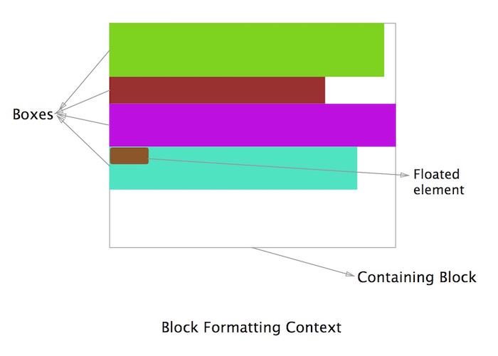
简单的说:上图中所有属于 BFC 的 box 都默认左对齐,并且它们的左边距可以触及到容器 container 的左边。最后一个 box,尽管它是浮动的,但它依然遵循这个原则。(BFC 中的浮动下面会介绍)
1 | -那么,BFC到底有什么卵用呢? |
# 1. 利用 BFC 可以消除 Margin Collapse
在正常情况下,在一个容器内的所有 box 将会由上至下依次垂直排列,即我们所说的一个元素占一行,并切垂直相邻的距离 (即 margin) 是由各自的 margin 决定的,而不是两个 margin 的叠加。
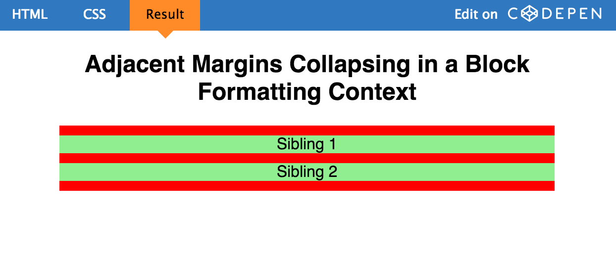
让我们看一个例子:红色的 div 包含三个绿色的 p 元素。
HTML 代码:
1 | <div class="container"> |
CSS 代码:
1 | .container { |
理想情况下,我们会认为 p 标签之间的 margin 应该是它们的和 (20px), 但实际上却是 10px. 这其实是 collapsing margins。
结果如下:
这似乎让人有点困惑,BFC 导致了 margin collapse,而现在又要用它来解决 margin cllapse. 但是始终要记住一点:只有当元素在同一个 BFC 中时,垂直方向上的 margin 才会 clollpase. 如果它们属于不同的 BFC,则不会有 margin collapse. 因此我们可以再建立一个 BFC 去阻止 margin collpase 的发生。
现在 HTML 变成:
1 | <div class="container"> |
CSS 也有改变:
1 | .container { |
现在的结果为:
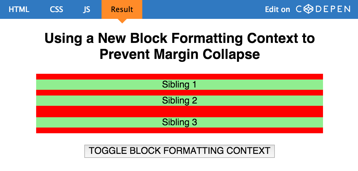
由于第二个 p 元素和第三个 p 元素属于不同的 BFC,因此避免了 margin collapse.
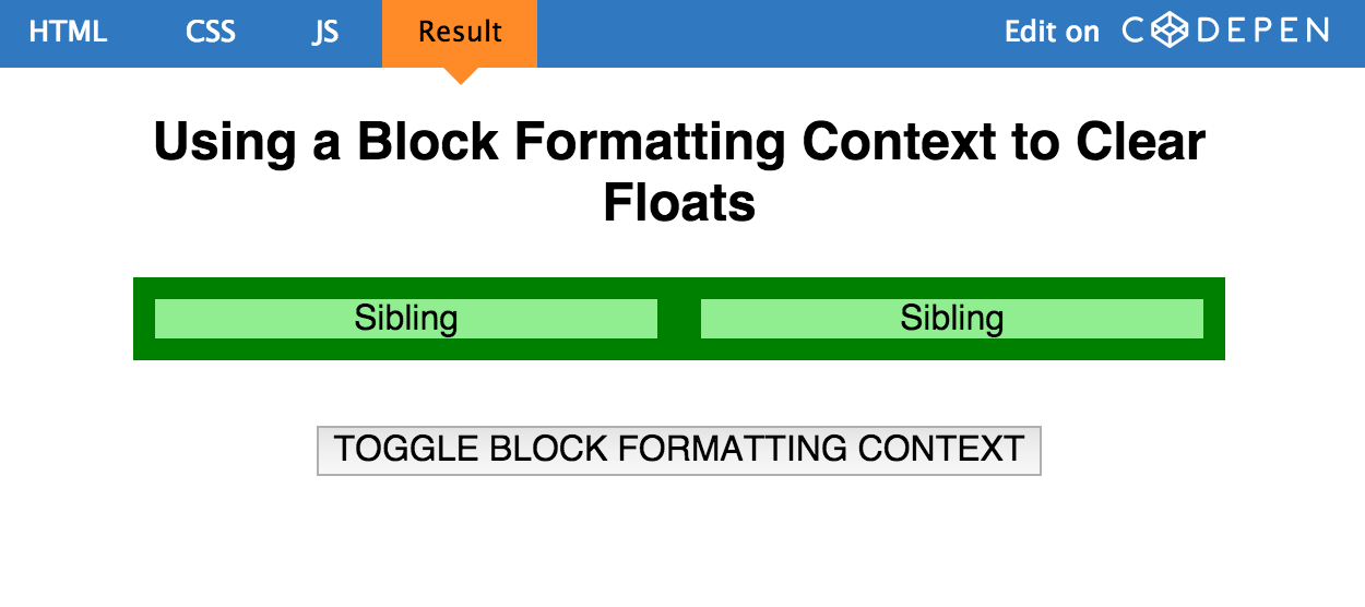
####2. 利用 BFC 去容纳浮动元素
我相信大家经常会遇到一个容器里有浮动元素,但是这个容器的高度却是 0 的场景,如下图:
看下面的例子:
HTML:
1 | <div class="container"> |
CSS:
1 | .container { |
结果:
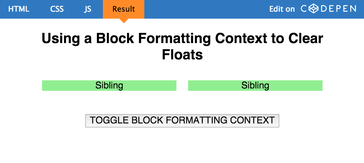
在上边的情形中,container 是不会有高度的,因为它包含了浮动元素。通常我们解决这个问题的办法是利用一个伪元素去实现 clear fix,但是现在我们有了更好的解决办法,即利用 BFC,因为它够容纳浮动元素的。 我们现在让 container 形成 BFC 规则,结果如下:
1 | .container { |
结果:
# 3. 利用 BFC 阻止文本换行
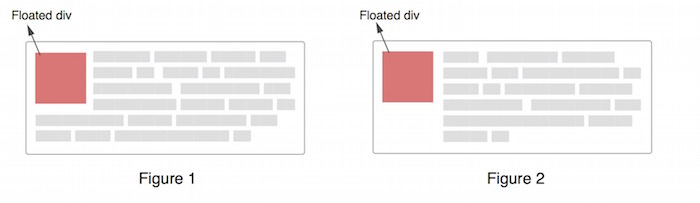
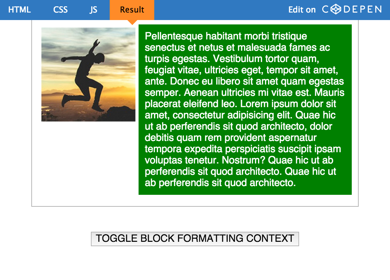
有时候,确切的说大多数情况 (若没有特殊设置),文本将会环绕浮动元素 (如 Figure 1), 但有时候这并不是我们期望的,我们想要的是 Figure2。
往往可能大家都会选择利用 margin-left 来强行让 p 的容器有一个左边距,而距离恰好为 Floated div 的宽度,但现在我们可以利用 BFC 更好的解决这个问题。
首先让我们了解一下文本换行的原理吧:
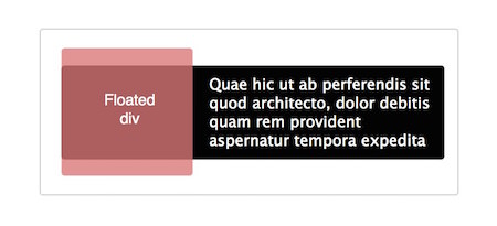
在 Figure1 中,整个 p 元素实际上是处于上图中的黑色区域,p 元素没有移动是因为它在浮动元素的下方。但实际上 p 作为行块级别的元素(相对于行内文本)却发生了移动,因为要给 float 元素’腾’位置,而随着文本的增加,文本高度超过浮动元素的部分则不会在水平方向上收缩内部距离,因此看起来像是环绕。
如图:
在解决这个问题之前,我们先来看一下 W3C 的规范在这方面的描述:
In a block formatting context, each box’s left outer edge touches the left edge of the containing block (for right-to-left formatting, right edges touch). This is true even in the presence of floats (although a box’s line boxes may shrink due to the floats), unless the box establishes a new block formatting context (in which case the box itself may become narrower due to the floats).
W3C 为这种情况提供了一个解决方案: unless the box establishes a new block formatting context ,即为 p 建立 BFC。
结果:
注:此文为译文 原文请戳