# Font
# Units
| 单位 | 含义 |
|---|---|
| px | 一个像素点,1920 x 1080 |
| em | 相对父容器的 font-size 的倍数 |
| rem | 相对根元素 (html) font-size 的倍数 |
| vw/vh | 相对 viewport width/height 的百分比,100vw, 100% 视口宽度 |
| vmin/vmax | 相对荧幕较短的一边 / 较长的一边 (一般用于手机横竖屏) |
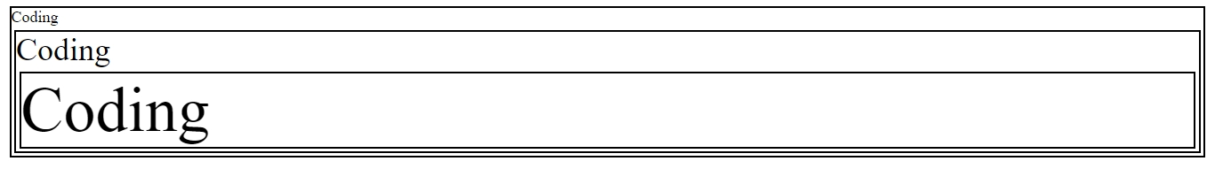
em,第一层 div 的 font-size 是 body font-size 的两倍,即 20px,第二层 div font-size 是第一层的两倍,即 40px, 第三层 div font-size 是第二层的两倍,即 80px.
1 |
|
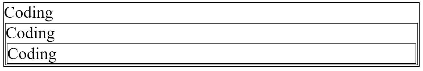
rem,替换上边 div 中的 font-size: 2em 为 font-size: 2rem, div 的 font-size 都为根元素 html font-size: 30px 的两倍即 60px
vw,vh, 100vw,100vh 可以全屏显示。
1 |
|
vw 和 % 区别是,vw 始终相对于视口,% 相对于父元素,将 div.son 中的 width: 100vw 替换为 width: 100%, 此时只会显示屏幕宽度的一半,因为 div.son 的父元素 div.box width: 50%.
# rem
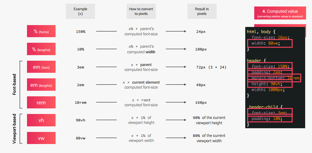
在使用 rem 作为单位时,为了便于计算会在 html 标签中设置 font-size 为 10px, 这样需要将 px 转换为 rem 只需要除以 10 即可。另外因为用户可以调整浏览器的字体大小,不能直接设定为固定的 10px, 应该使用百分比设定。浏览器默认字体为 16px, 10 / 16 = 62.5%.
1 | html { |
# Heading default font sizes
| Tag | Font Size | Font Size(Parent font size is 16px) |
|---|---|---|
| h1 | 2em | 32px |
| h2 | 1.5em | 24px |
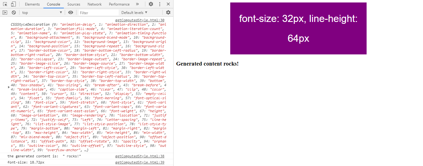
| h3 | 1.17em | 18.72px |
| h4 | 1em | 16px |
| h5 | 0.83em | 13.28px |
| h6 | 0.67em | 10.72px |
# Convert Units from Relative to Absolute(px)
# line-height
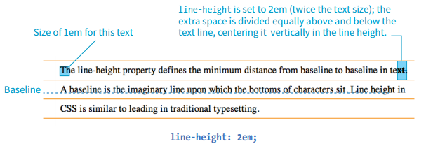
The line-height property defines the minimum distance from baseline to baseline in text. The line-height property is said to specify a “minimum” distance because if you
put a tall image or large characters on a line, the height of that line expands to accommodate it.
A baseline is the imaginary line upon which the bottoms of characters sit. Setting a line height in CSS is similar to adding leading in traditional typesetting; however, instead of space being added between lines, the extra space is split above and below the text. The result is that line-height defines the height of a line-box in which the text line is vertically centered.
# color
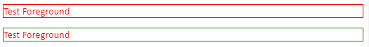
The color property is not strictly a text-related property. In fact, according to the CSS specification, it is used to change the foreground (as opposed to the background) color of an element. The foreground of an element consists of both the text it contains as well as its border. So, when you apply a color to an element (including image elements), know that color will be used for the border as well, unless there is a specific border-color property that overrides it.
1 | <p class="color1">Test Foreground</p> |
1 | .color1 { |
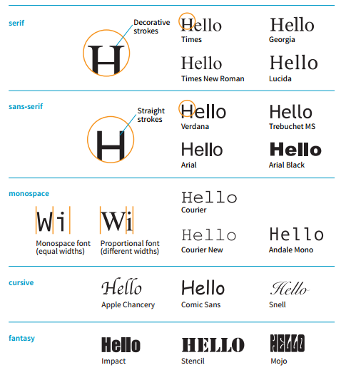
# Generic font families
1 | p { |
# Background
# background-position
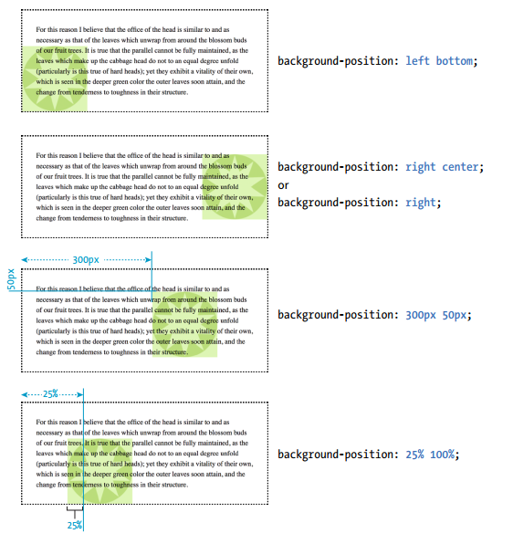
It is important to note that the percentage value applies to both the canvas area and the image itself. A horizontal value of 25% positions the point 25% from the left edge of the image at a point that is 25% from the left edge of the background positioning area. A vertical value of 100% positions the bottom edge of the image at the bottom edge of the positioning area. background-position: 25% 100%; As with keywords, if you provide only one percentage, the other is assumed to be 50% (centered) .
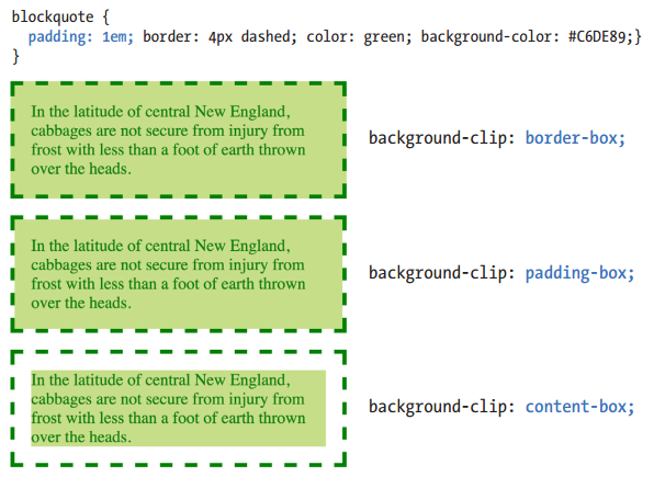
# background-clip
Traditionally, the background painting area (the area on which fill colors are applied) of an element extends all the way out to the outer edge of the border.CSS3 introduced the background-clip property to give designers more control over where the painting area begins and ends.
The default border-box value draws the painting area to the outside edge of the border. padding-box starts the painting area on the outside edge of the padding area for the element (and to the inside edge of the border). Finally, content-box allows the background to fill only the content area for the element.
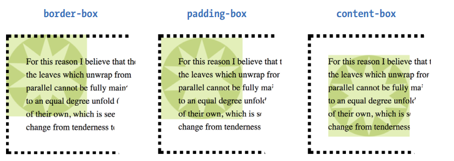
# background-origin
This property defines the boundaries of the background positioning area in the same way background-clip defined the background painting area. But it’s default value is padding-box You can set the boundaries to the border-box (so the origin image is placed under the outer edge of the border, padding-box (outer edge of the padding, just inside the border), or content-box (the actual content area of the element).
# background-image
背景图片太显眼和容器背景不协调时可以在背景图片上加上透明的渐变背景渐变背景。
1 | .cta-img-box { |
| Before | After |
|---|---|
 |
 |
# Shadow
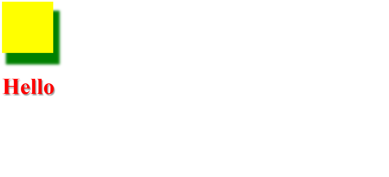
css 中 shadow 包括 text-shaow 和 box-shadow, 常用形式分别为 h-offset v-offset blur color 和 h-offset v-offset blur spread color 其中 text-shadow 没有 spread 属性。
1 |
|
# Inset border
使用 border 给元素添加外部边框时会影响到外部元素的布局,如果边框在元素内部就可以解决这种问题,但是 border 不支持内部边框,可以使用 box-shadow 模拟,例如 box-shadow: inset 0 0 0 3px #fff; 看起来像是在元素内部添加了 3px 的白色边框。
THE MARKUP
1 | <a href="#" class="btn btn--full margin-right-small">Start eating well</a> |
THE STYLE
1 | .btn:link, |
# Box
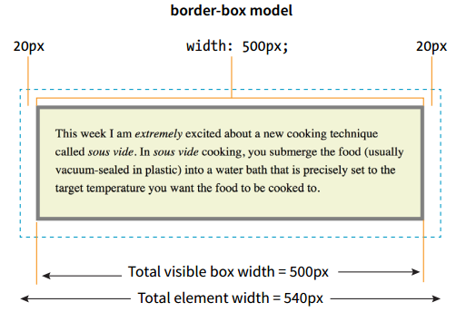
# box-sizing
1 | p { |
Element box = 20px + 5px + 20px + 500px width + 20px + 5px + 20px = 590 pixels
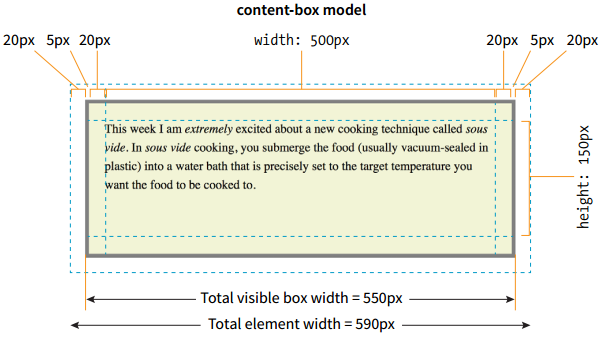
Element box = 20px + 500px width + 20px = 540 pixels
# border-radius
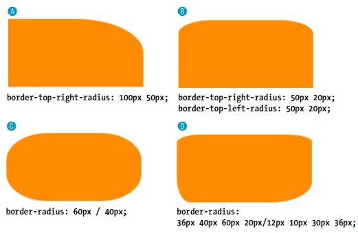
Elliptical corners you can make a corner elliptical by specifying two values: the first for the horizontal radius and the second for the vertical radius (see FIGURE A and B).
A
1 | border-top-right-radius: 100px 50px; |
B
1 | border-top-right-radius: 50px 20px; |
If you want to use the shorthand property, the horizontal and vertical radii get separated by a slash (otherwise, they’d be confused for different corner values). The following example sets the horizontal radius on all corners to 60px and the vertical radius to 40px (FIGURE C):
C
1 | border-radius: 60px / 40px; |
If you want to see something really nutty, take a look at a border-radius shorthand property that specifies a different ellipse for each of the four corners. All of the horizontal values are lined up on the left of the slash in clockwise order (top-left, top-right, bottom-right, bottom-left), and all of the corresponding vertical values are lined up on the right (FIGURE D):
1 | border-radius: 36px 40px 60px 20px / 12px 10px 30px 36px; |
# Collapsing margins
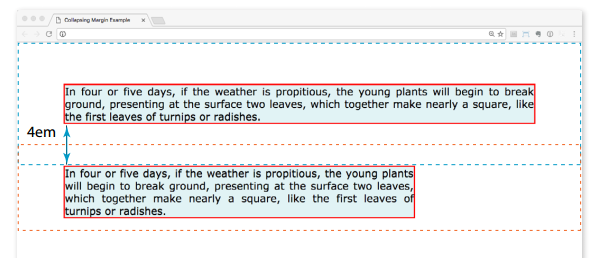
The most significant margin behavior to be aware of is that the top and bottom margins of neighboring elements collapse. This means that instead of accumulating, adjacent margins overlap, and only the largest value is used.
Using the two paragraphs as an example, if the top element has a bottom margin of 4em, and the following element has a top margin of 2em, the resulting margin space between elements does not add up to 6ems Rather, the margins collapse and the resulting margin between the paragraphs will be 4em, the largest specified value. This is demonstrated as below.
The only time top and bottom margins don’t collapse is for floated or absolutely positioned elements. Margins on the left and right sides never collapse, so they’re nice and predictable.
# Margins on inline elements
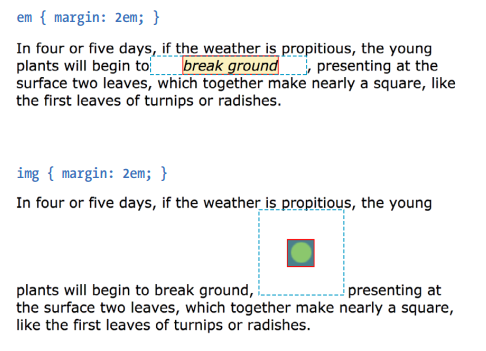
You can apply top and bottom margins to inline text elements (or “nonreplaced inline elements,” to use the proper CSS terminology), but it won’t add vertical space above and below the element, and the height of the line will not change. However, when you apply left and right margins to inline text elements, margin space will be held clear before and after the text in the flow of the element, even if that element breaks over several lines.
Just to keep things interesting, margins on replaced inline elements, such as images, do render on all sides, and therefore do affect the height of the line.
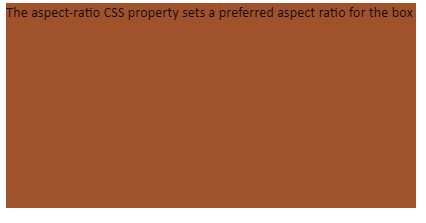
# aspect-ratio
The aspect-ratio CSS property sets a preferred aspect ratio for the box, which will be used in the calculation of auto sizes and some other layout functions.
在 box 中输入文字,box 的长宽比保持在 2 / 1.
1 |
|
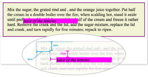
# Setting height use padding-bottom
当父容器没有 intrinsic 的高度时,子元素设置 height 相对于父容器的百分比时没有效果,这时可以使用 padding 设置相对于父容器宽度的百分比,实现子元素 height 的设置,例如 padding-bottom: 60%; 如果子元素不包含其它内容,会设置子元素的高度是父元素宽度的 60%。
1 | .step-img-box { |
# Inline、Block and Inline-block
block 元素不设定宽度默认会占据一整行,inline, inline-block 会占据内容的宽度
block 元素水平居中使用 margin: 0 auto, inline, inline-block 水平居中使用 text-align:center
block, inline-block 元素可以设置宽度高度,inline 元素宽度高度设置无效
1 |
|

inline 元素的上下外边距无效,如果需要为 inline 元素设置上下外边距,需要将 dispaly 设置为 inline-block
1 |
|

为 strong 添加 disply: inline-block

# Position
# position: absolute
1 | p { |
- The offset values apply to the outer edges of the element box (the outer margin edge) for absolutely positioned elements. For relatively positioned elements, the offset is measured to the box itself (not the outer margin edge).
- Absolutely positioned elements always behave as block-level elements. For example, the margins on all sides are maintained, even though this is an inline element. It also permits a width to be set for the element.
Be careful when positioning elements at the bottom of the initial containing block (the html element). Although you may expect it to be positioned at the bottom of the whole page, browsers actually place the element at the bottom of the browser window. Results may be unpredictable. If you want something positioned at the bottom of your page, put it in a containing block element at the end of the document source, and go from there.
# Layout
# Float and Overflow
float 元素父容器未设定高度
1 |
|

div.container 设定 height: 200px
div.container 设定 overflow: hidden, 删除 height: 200px, 在不给元素设置高度的情况下,将 overflow 设置为 hidden 时,它会显示内部元素的高度。

float + overflow 实现 navbar
1 |
|

# Overflow and Position
当子元素使用 position 定位,而父元素没有使用 position 定位时,使用 overflow: hidden , 子元素超出父元素的内容不会被隐藏,需要在父元素上添加定位,例如 position: relative .
THE MARKUP
1 | <div class="parent"> |
THE STYLE
1 | .parent { |
| without position of parent | has position of parent |
|---|---|
 |
 |
在 body 中使用 overflow 时需要注意,只有在没有 position:absolute 相对于 body 的情况下才会起作用。
1 | body { |
# Aligning items with margins in Flexbox
THE MARKUP
1 | <ul> |
THE STYLES
1 | ul { |

I’ve turned the unordered list (ul) into a flex container, so its list items (li) are now flex items. By default, the items would stay together at the start of the main axis (on the left) with extra space on the right. Setting the right margin on the logo item to auto moves the extra space to the right of the logo, pushing the remaining items all the way to the right (the “main end”).
This technique applies to a number of scenarios. If you want just the last item to appear on the right, set its left margin to auto . Want equal space around the center item in a list? Set both its left and right margins to auto . Want to push a button to the bottom of a column? Set the top margin of the last item to auto . The extra space in the container goes into the margin and pushes the neighboring items away.
When you use margin: auto on a flex item, the justify-content property no longer has a visual effect because you’ve manually assigned a location for the extra space on the main axis.
# Handy shortcut flex item values
-
flex: initial
This is the same as
flex: 0 1 auto. It prevents the flex item from growing even when there is extra space, but allows it to shrink to fit in the container. The size is based on the specifiedwidth/heightproperties, defaulting to the size of the content. With the initial value, you can usejustify-contentfor horizontal alignment. -
flex: auto
This is the same as
flex: 1 1 auto. It allows items to be fully flexible, growing or shrinking as needed. The size is based on the specifiedwidth/heightproperties. -
flex: none
This is equivalent to
flex: 0 0 auto. It creates a completely inflexible flex item while sizing it to thewidthandheightproperties. You can also usejustify-contentfor alignment when flex is set tonone. -
flex: integer
This is the same as flex:
integer 1 0px. The result is a flexible item with a flex basis of 0, which means it has absolute flex (see theAbsolute Versus Relative Flex) and free space is allocated according to the flex number applied to items.
# Absolute Versus Relative Flex
If flex-basis is set to any size other than zero (0), such as a particular width/height value or auto . This is called relative flex.
However, if you reduce the value of flex-basis to 0, something interesting happens. With a basis of 0, the items get sized proportionally according to the flex ratios, which is known as absolute flex. So with flex-basis: 0 , an item with a flex-grow value of 2 would be twice as wide as the items set to 1. Again, this kicks in only when the flex-basis is 0.
In practice it is recommended that you always include a unit after the 0, such as 0px or the preferred 0%.
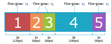
In this example of absolute flex, the first box is given a flex-grow value of 2, and the fourth box has a flex-grow value of 3 via the aforementioned shortcut flex: integer . In below FIGURE, you can see that the resulting overall size of the boxes is in proportion to the flex-grow values because the flex-basis is set to 0.
1 | .box { |
# inline-flex
使用 inline-flex 可以实现两个元素保持同等宽度.
THE MARKUP
1 | <div class="box"> |
THE STYLES
1 | .box { |
# Grid Specifying track size values
# Fractional units (flex factor)
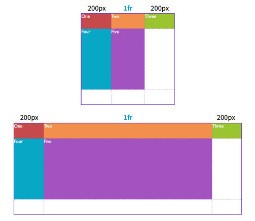
The Grid-specific fractional unit ( fr ) allows developers to create track widths that expand and contract depending on available space. As below, if I set the middle column to 1fr, the browser assigns all leftover space (after the 200-pixel column tracks are accommodated) to that column track.
1 | #layout { |
# Minimum and maximum size range
You can constrict the size range of a track by setting its minimum and maximum widths using the minmax() function in place of a specific track size.
1 | grid-template-columns: 200px minmax(15em, 45em) 200px; |
This rule sets the middle column to a width that is at least 15em but never wider than 45em. This method allows for flexibility but allows the author to set limits
# Content-based sizing
The min-content, max-content, and auto values size the track based on the size of the content within it.
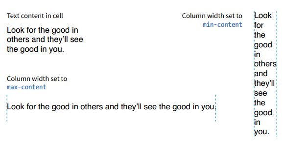
The min-content value is the smallest that track can get without overflowing (by default, unless overridden by an explicit min-width ). It is equivalent to the “largest unbreakable bit of content”—in other words, the width of the longest word or widest image. It may not be useful for items that contain normal paragraphs, but it may be useful in some cases when you don’t want the track larger than it needs to be. This example establishes three columns, with the right column sized just wide enough to hold the longest word or image:
1 | grid-template-columns: 50px 1fr min-content; |
The max-content property allots the maximum amount of space needed for the content, even if that means extending the track beyond the boundaries of the grid container. When used as a column width, the column track will be as wide as the widest content in that track without line wrapping. That means if you have a paragraph, the track will be wide enough to contain the text set on one line. This makes max-content more appropriate for short phrases or navigation items when you don’t want their text to wrap (auto may work better because it allows wrapping if there’s not enough room).
Using the auto keyword for a track size is basically like handing the keys over to the browser. In general, it causes the track to be sized large enough to accommodate its content, while taking into consideration what other restrictions are in place.
In the minmax() function, the auto keyword behaves very similarly to either min-content or max-content , depending on whether you put it in the minimum or maximum slot. As a keyword on its own, it functions similarly to minmax(min-content, max-content) , allowing the track to squeeze as narrow as it can without anything overflowing, but grow to fit its content without wrapping if there’s enough space.
Unlike max-content , an auto maximum allows align-content and justify-content to stretch the track beyond the size of the content. As a minimum, it has a few more smarts than min-content —for example, using a specified min-width or min-height on an item (if any) instead of its min-content size, and ignoring the contents of any grid items with scrollbars.
If you want to size a track based on its content, but you’re not sure which
keyword to use, start with auto .
# Repeating track sizes
In the previous repeat() examples, we told the browser how many times to repeat the provided pattern. You can also let the browser figure it out itself based on the available space by using the auto-fill and auto-fit values instead of an integer in repeat() .
For example, if I specify grid-template-rows: repeat(auto-fill, 10em); and the grid container is 35em tall, then the browser creates a row every 10 ems until it runs out of room, resulting in three rows. Even if there is only enough content to fill the first row, all three rows are created and the space is held in the layout.
The auto-fit value works similarly, except any tracks that do not have content get dropped from the layout. If there is leftover space, it is distributed according to the vertical ( align-content ) and horizontal ( justify-content ) alignment values provided (we’ll discuss alignment later in this section).
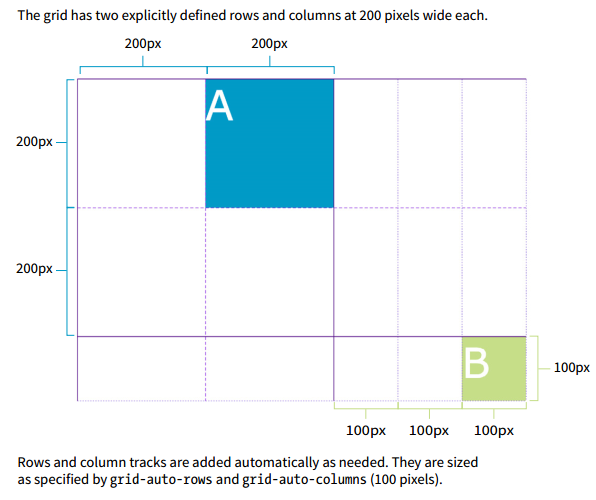
# Implicit Grid Behavior
Along the way, we’ve encountered a few of the Grid system’s automatic, or implicit, behaviors. For example, without explicit placement instructions, grid items flow into the grid sequentially. I also pointed out how creating a named area implicitly generates grid lines with the “-start” and “-end” suffixes, and vice versa.
Another implicit Grid behavior is the creation of row and column tracks on the fly to accommodate items that don’t fit in the defined grid. For example, if you place an item outside a defined grid, the browser automatically generates tracks in the grid to accommodate it. Similarly, if you simply have more items than there are cells or areas, the browser generates more tracks until all the items are placed.
By default, any row or column automatically added to a grid will have the size auto, sized just large enough to accommodate the height or width of the contents. If you want to give implicit rows and columns specific dimensions, such as to match a rhythm established elsewhere in the grid, use the grid-auto-* properties.
The grid-auto-rows and grid-auto-columns properties provide one or more track sizes for automatically generated tracks and apply to the grid container. If you provide more than one value, it acts as a repeating pattern. As just mentioned, the default value is auto , which sizes the row or column to accommodate the content.
In this example, I’ve explicitly created a grid that is two columns wide and two columns high. I’ve placed one of the grid items in a position equivalent to the fifth column and third row. My explicit grid isn’t big enough to accommodate it, so tracks get added according to the sizes I provided in the grid-auto-* properties.
THE MARKUP
1 | <div id="littlegrid"> |
THE STYLES
1 | #littlegrid { |
# Media Query
In media queries rem and em do NOT depend on html font-size ! Instead, 1rem = 1em = 16px.
As below, max-width: 84em represent max-width: 1344px , 1344 = 84 * 16
1 | html { |
1 | @media (max-width: 84em) { |
# Center Layout
position + transform, 设置需要居中的原素 position: absolute, 然后 top: 50%, left: 50%, 此时元素的顶端距离浏览器顶端为浏览器高度的一边,左端离浏览器左端的距离为浏览器宽度的一半,最后 transform: translate (-50%, -50%); 将元素向左移动自身宽度的一半,向上移动自身高度的一半,即元素中心点距离浏览器顶端为浏览器高度的一边,离浏览器左端的距离为浏览器宽度的一半。
1 |
|
flex
1 |
|
table
1 |
|
# Tansitions, Transforms and Animation
# Time Functions
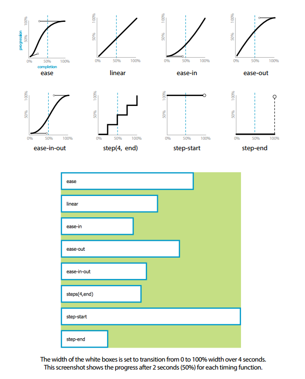
- ease
Starts slowly, accelerates quickly, and then slows down at the end. This is the default value and works just fine for most short transitions. - linear
Stays consistent from the transition’s beginning to end. Because it is so consistent, some say it has a mechanical feeling. - ease-in
Starts slowly, then speeds up. - ease-out
Starts out fast, then slows down. - ease-in-out
Starts slowly, speeds up, and then slows down again at the very end. It is similar to ease, but with less pronounced acceleration in the middle. - cubic-bezier(x1,y1,x2,y2)
- steps(#, start|end)
Divides the transitions into a number of steps as defined by a stepping function. The first value is the number of steps, and the start and end keywords define whether the change in state happens at the beginning (start) or end of each step. Step animation is especially useful for keyframe animation with sprite images. For a better explanation and examples, I recommend the article “Using Multi-Step Animations and Transitions,” by Geoff Graham on CSS-Tricks (css-tricks.com/using-multistep-animations-transitions/). - step-start
Changes states in one step, at the beginning of the duration time (the same as steps(1,start)). The result is a sudden state change, the same as if no transition had been applied at all. - step-end
Changes states in one step, at the end of the duration time (the same as steps(1,end))
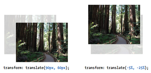
# Transforming the Position (translate)
Provide length values in any of the CSS units or as a percentage value. Percentages are calculated on the width of the bounding box—that is, from border edge to border edge (which, incidentally, is how percentages are calculated in SVG, from which transforms were adapted). You can provide positive or negative values.
# Applying Multiple Transforms
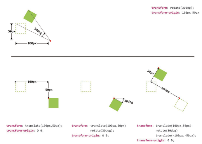
It is important to note that transforms are applied in the order in which they are listed. For example, if you apply a translate() and then rotate() , you get a different result than with a rotate() and then a translate() . Order matters.
Another thing to watch out for is that if you want to apply an additional transform on a different state (such as :hover , :focus , or :active ), you need to repeat all of the transforms already applied to the element. For example, this a element is rotated 45 degrees in its normal state. If I apply a scale() transform on the hover state, I would lose the rotation unless I explicitly declare it again:
1 | a { |
To achieve both the rotation and the scale, provide both transform values:
1 | a:hover { |
# transform-origin
可以用两次位移变形 translate 来 代 替 变 形 原 点 transform-origin 的作用。红色圆点表示每次变形的原点。 上图:演示了 transform-origin 的原理;下图:以分步的方式演示了两次位移代替 transform-origin 的原理 。
# Transition of hide to show
display 不能使用 transition, 可以使用 opacity: 0 到 opacity: 1 模拟元素从无到有。
1 | .main-nav { |
1 | .nav-open .main-nav { |
# Filter
# grayscale
在 html 标签设置 grayscale(100%) 可以把整个网页都变成灰色效果。
1 |
|
# brightness
当图片各部分颜色差别比较大时,使用 grayscale 实现灰度效果时各部分对比会比较明显,不一致, 可以使用 brightness + opacity 实现。

grayscale
1 | filter: grayscale(100%); |

brightness + opacity
1 | filter: brightness(0); |

# Change Theme Schema
反转网站主题色
1 将背景设置为与原来相反的黑色,使用滤镜反转整个网页中的元素
1 | { |
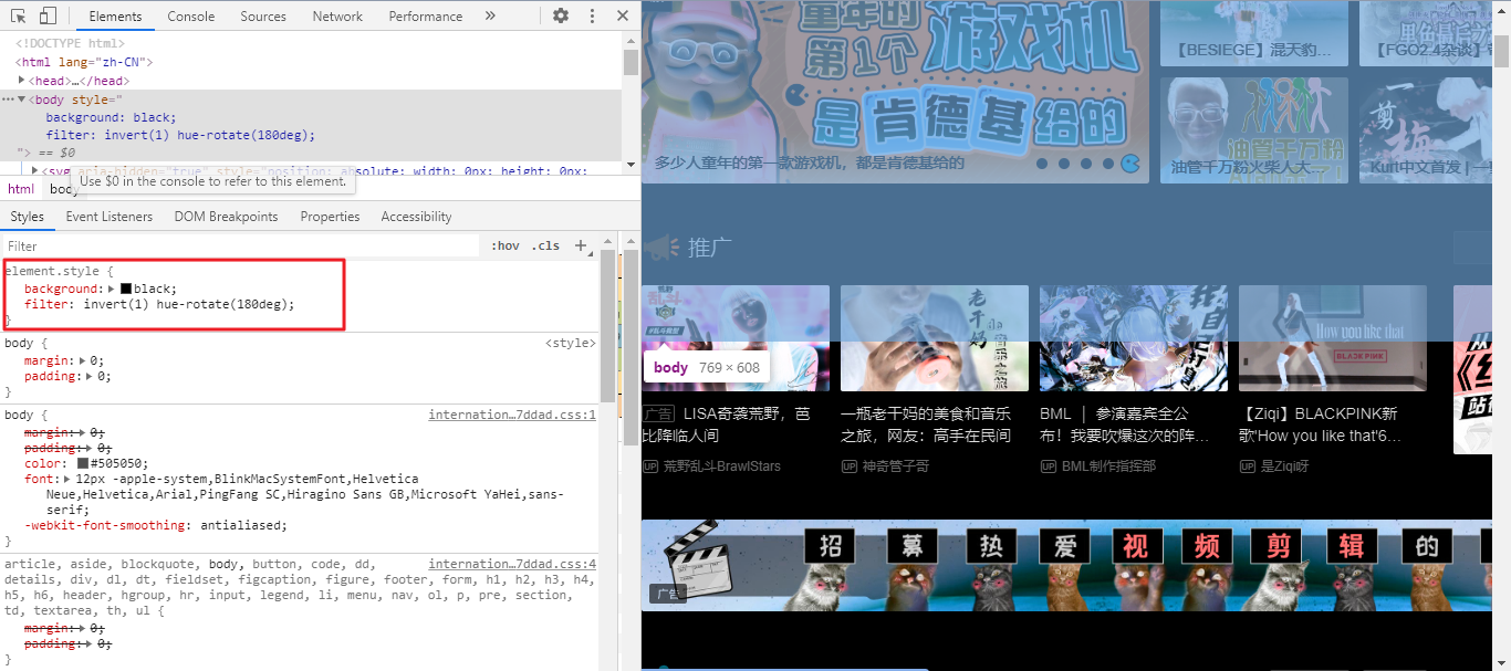
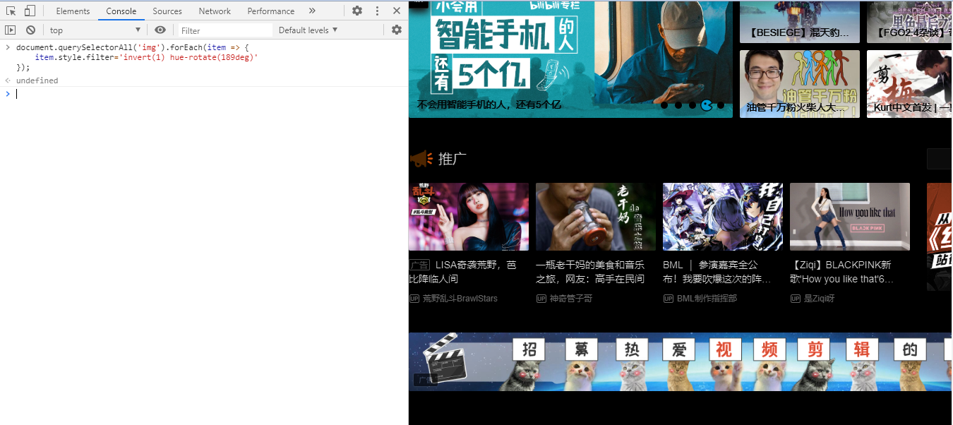
2 图片需要保持原来的模样
1 | document.querySelectorAll("img").forEach((item) => { |
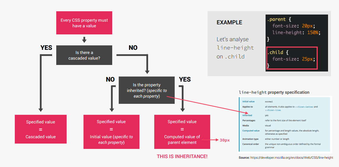
# CSS Mechanism
# CSS Values Processed
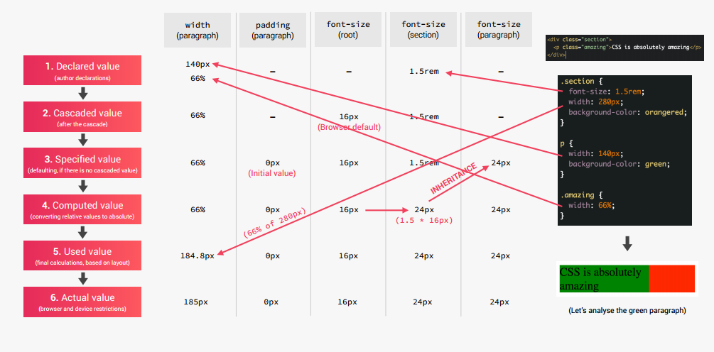
# CSS Inheritance
# CSS Selector
# Selector Specificity
(A, B, C, D) 前面的越大优先级越高。
A: 行内样式 (可以被!important 覆盖,例如使用!important 覆盖 bootstrap 等的行内样式)。
B: ID 选择器 #container。
C: Class, 属性和伪类选择器 .title, input [type=‘text’], :hover。
D: 元素和伪元素择器 div, ::before。
1 |
|
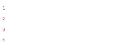
# Select not first child
-
使用
not伪类选择器。1
2
3p:not(:first-child) {
color: red;
} -
使用
nth-child选择器,nth-child(n + 2)中的 n 代表从 0 开始的自然数,n + 2 表示>= 2的自然数。1
2
3p:nth-child(n + 2) {
color: red;
} -
使用
+选择器,表示选择紧跟着的兄弟元素。p + p表示 p 元素相邻后面的 p 元素,第一个 p 元素不会选中。~表示选择所有后面所有的兄弟元素。1
2
3
4
5
6
7
8
9
10
11
12
13
14
15
16
17<!DOCTYPE html>
<html lang="en">
<head>
<title>CSS Not First Child</title>
<style>
p + p {
color: red;
}
</style>
</head>
<body>
<p>1</p>
<p>2</p>
<p>3</p>
<p>4</p>
</body>
</html>Result:
![]()
# last-child & last-of-type
1 | <div class="parent"> |
1 | /* Cannot select `Third Child`, because p is't last child of parent */ |
# focus
1 | *:focus { |
# focus-within
The :focus-within CSS pseudo-class matches an element if the element or any of its descendants are focused. In other words, it represents an element that is itself matched by the :focus pseudo-class or has a descendant that is matched by :focus . (This includes descendants in shadow trees.)
1 |
|


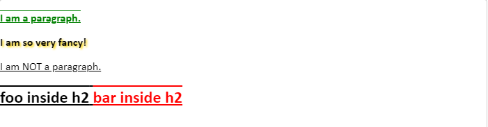
# not
The :not() CSS pseudo-class represents elements that do not match a list of selectors. Since it prevents specific items from being selected, it is known as the negation pseudo-clas.
The :not() pseudo-class requires a comma-separated list of one or more selectors as its argument. The list must not contain another negation selector or a pseudo-element. :not( <complex-selector-list> )
1 | <p>I am a paragraph.</p> |
1 | .fancy { |
# @layer
@layer - CSS: Cascading Style Sheets | MDN
# Accessbility
# role and aria-label
当使用 background-image 而不是使用 img 标签设置图像时,为了 accessbility (可访问性),可以为设置背景图像的元素设置 role="img" , 然后在 aria-label 设置类似 img 标签 alt 的内容。这样读屏设备就可以读取。
THE MARKUP
1 | <div |
THE STYLE
1 | .cta-img-box { |
# HTML Element
# table
1 |
|
# thead
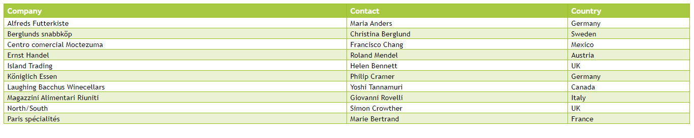
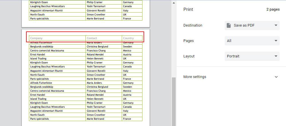
标题放在 thead 中打印时如果有多页后续页也会包含标题,另外也不会出现截断行数据的情况。
# button
remove all style of button.
1 | button { |
# Tooltip by title attribute
1 |
|
# dialog
: The Dialog element - HTML: HyperText Markup Language | MDN
# JS API
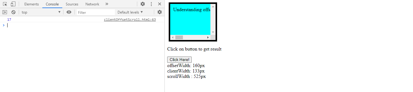
# offsetWidth, clientWidth, scrollWidth
offsetWidth: 包括所有边框的大小。如果元素有 display: block,则可以通过 width/height 和 padding 和 border 的和来计算
width(130px) + padding(10px _ 2) + border(5px _ 2) = 160px
clientWidth: 框内容的可视部分,不包括边框或滚动条,但包括填充。不能直接从 CSS 中计算,取决于系统的滚动条大小。
width(130px) + padding(10px * 2) - scrollBarWidth(17px) = 133px
1 | const scrollbarWidth = |
scrollWidth: 框中所有内容的大小,包括当前隐藏在滚动区域之外的部分。不能直接从 CSS 计算,取决于内容。
1 |
|
# getComputedStyle
getcomputedstyle () 方法在应用活动样式表并解决这些值可能包含的任何基本计算之后,返回一个对象,其中包含元素的所有 CSS 属性的值。单个 CSS 属性值可以通过对象提供的 api 访问,或者通过对 CSS 属性名称进行索引访问。
1 | const style = window.getComputedStyle(element [, pseudoElt]); |
1 |
|
# requestAnimationFrame
window.requestAnimationFrame() 告诉浏览器 —— 你希望执行一个动画,并且要求浏览器在下次重绘之前调用指定的回调函数更新动画。该方法需要传入一个回调函数作为参数,该回调函数会在浏览器下一次重绘之前执行
注意:若你想在浏览器下次重绘之前继续更新下一帧动画,那么回调函数自身必须再次调用 window.requestAnimationFrame ()
1 | window.requestAnimationFrame(callback); |
-
callback下一次重绘之前更新动画帧所调用的函数 (即上面所说的回调函数)。该回调函数会被传入
DOMHighResTimeStamp参数,该参数与performance.now()的返回值相同,它表示requestAnimationFrame()开始去执行回调函数的时刻。 -
返回值
一个
long整数,请求 ID ,是回调列表中唯一的标识。是个非零值,没别的意义。你可以传这个值给window.cancelAnimationFrame()以取消回调函数。
1 |
|
# DocumentFragment
DocumentFragment - Web APIs | MDN
# SCSS
# Common Use Mixins
clearfix
1 | @mixin clearfix { |
absCenter
1 | @mixin absCenter { |
respond
1 | /* |
# CSS Tools
Tint and Shade Generator
Squoosh Squoosh can reduce file size and maintain high quality
# Other
# CSS Meaingful Class Names
# Architecting with Files and Folders
# CSS image resize percentage of itself
引用:html - CSS image resize percentage of itself? - Stack Overflow
I am trying to resize an img with a percentage of itself. For example, I just want to shrink the image by half by resizing it to 50%. But applying width: 50%; will resize the image to be 50% of the container element (the parent element which maybe the <body> for example).
Question is, can I resize the image with a percentage of itself without using javascript or server side? (I have no direct information of the image size)
-
This method resize image only visual not it actual dimensions in DOM, and visual state after resize centered in middle of original size. you can use
transform-origin: top leftadjust scale origin.html:
1
<img src="example.png" />
css:
1
2
3
4
5
6
7
8
9
10.fake {
transform-origin: top left;
-webkit-transform: scale(0.5); /* Saf3.1+, Chrome */
-moz-transform: scale(0.5); /* FF3.5+ */
-ms-transform: scale(0.5); /* IE9 */
-o-transform: scale(0.5); /* Opera 10.5+ */
transform: scale(0.5);
/* IE6–IE9 */
filter: progid:DXImageTransform.Microsoft.Matrix(M11=0.9999619230641713, M12=-0.008726535498373935, M21=0.008726535498373935, M22=0.9999619230641713,SizingMethod='auto expand');
} -
The trick is to let the container element shrinkwrap the child image, so it will have a size equal to that of the unsized image. Thus, when setting
widthproperty of the image as a percentage value, the image is scaled relative to its original scale.html:
1
2
3<span>
<img src="example.png" />
</span>css:
1
2
3
4
5
6
7span {
display: inline-block;
}
img {
width: 50%;
height: 50%;
} -
you can also take advantage of the newly introduced CSS3
fit-content. However, not all popular browser versions support it at the time of writing.html:
1
2
3<figure>
<img src="example.png" />
</figure>css:
1
2
3
4
5
6
7
8
9figure {
height: fit-content;
width: fit-content;
}
img {
height: 50%;
width: 50%;
}